


Below are some resources to help you learn about file formats, color matching, and the printing process. This information will also help you understand the requirements for the best prepared print-ready files for the optimum results with your label projects.
Supplying correctly-formatted, print-ready, quality artwork is required for the best printing results. Before being able to give you a precise print quote, we may need to see your final art files. Your Label Specialist will contact you if we need to review your files for printing.
Carefully review our print-ready file requirements. For details about critical color requirement for your label project, see the Color Matching section of this page.
You can email your print-ready artwork files directly to your Prynt Group Label Specialist or use the form at the bottom of this page.

Artwork must be print-ready per the following specifications:
Purely vector-based artwork is highly recommended as it produces the best quality output. It’s typically scalable up or down in size without any loss in image resolution. Typically, file types ending in .ai, .eps, .cdr, .svg, and sometimes .pdf contain only vector-based art files.
Pixel-based (also known as raster or bit-mapped) artwork may be used if the minimum resolution is 300 dpi/ppi (dots/pixels per inch) scaled to the exact size of the label. There should be no file compression. These types of files typically end in .psd, .tif (.tiff) .jpg (.jpeg), .gif, and .bmp. Any compression in these types of files usually produces unwanted artifacts making the image look pixelated (blurry) or distorted in color.
Occasionally we receive vector-based artwork that has some pixel-based elements included or embedded in the file These types of files generally do not produce good results and should be avoided.
We do not guarantee color output. However, colors can be matched more accurately by using vector-based art files with colors specified in the Pantone® Solid Coated Color Swatch Book. Read on for more information about color.
We recommend vector-based artwork for optimal print quality.
Acceptable vector-based art files include:
Adobe Illustrator (.ai)
Acceptable pixel-based art files include:
Photoshop (.psd)
Requirements for Pixel-based artwork:
• JPEG (.jpg) artwork files must be saved with minimum compression and maximum quality or your artwork could have compression artifacts or noise in your image that will reduce print quality

Artwork that is not print-ready will either not be usable by us, or will require an artist to make the artwork print-ready. Having our artists fix your files will likely incur an additional artwork fee.
All text must be converted to outlines or all the fonts must be supplied.
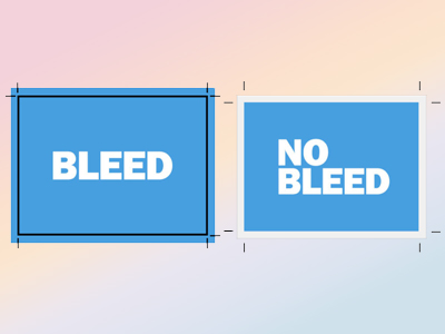
Artwork extending to the edge of the label should extend (bleed) beyond the edge of the label at least 0.05” (recommended) but not more than 0.1”.
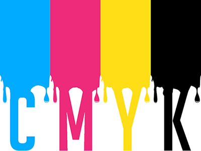
CMYK artwork files are recommended. We recommend embedding the Color Input Profile into your artwork files for the best color accuracy. We also recommend setting Pantone® colors in the artwork where needed using the Pantone® Solid Coated swatches. This will get the closest Pantone® color matches.
Metallic colors can be produced by printing on a metallic substrate.
White ink can be printed on clear or metallic substrates. Use a 100% magenta fill spot color named “White” to specify areas white ink is to be printed. We recommend putting white ink on a separate layer of your file.
Specify the edge of your label with a path. We recommend setting the stroke of the cut line to 100% cyan.
A minimum corner radius of 0.05” is required for DomeLabels. Radius corners are recommended for all labels for durability.
For variable data, we recommend sending a single artwork file. Indicate the variable areas or text, and include the variable information in an Excel or CSV (Comma Separated Values) file. Format data with each record (label) as a row, and each variable field as a column.
We can generate your variable barcodes, QR codes, or 2D codes optimized for our printing processes. We do not recommend using pre-generated codes. Let us know the size or area for the code, the code type, your code data, and we’ll take care of the rest.


Understanding some of the challenges of printing color will help you better prepare your print-ready art files and manage your expectations of color matching.
Process color printing, also known as four-color process printing (full color), is a printing method that reproduces finished, full-color artwork and photographs. The four colors that are used in process color printing are cyan, magenta, yellow and black (CMYK). These inks are translucent and are used to simulate different colors. For example, green can be created using cyan and yellow. The black ink is used primarily to create fine detail and shadows. Process colors are reproduced by overlapping ink dots (halftones) to simulate a large number of colors. These overlapping dots essentially trick the human eye to see a multitude of different colors.
If you need to match a particular color—perhaps a specific logo color—then spot color printing is often the best choice. Spot colors are printed with premixed inks on a conventional press, or replicated on digital press, or with ribbons on a thermal printer. Each spot color is reproduced using a single printing plate or color ribbon. To ensure that the printer uses the exact intended color, the Pantone® Matching System (PMS) is used. Each PMS number references a unique spot color found on a swatch chart. By using this type of numbering system, designers can specify exact colors for elements on a printed piece with repeatable results. It’s important to note that not all spot colors can be reproduced by process printing. Unlike process printing using a series of overlapping dots, spot colors are printed individually in various dot sizes to created different shades or tints of the spot color.
Color matching is very important because not all of the colors we can see in nature can be reproduced. Our computer monitor recreates colors by projecting red, green and blue (RGB) lights.
Printing traditionally recreates colors by mixing cyan, magenta, yellow and black (CMYK) inks. Color matching is important because your monitor cannot display every possible color you can see in nature. A commercial printer can reproduce even fewer colors than we can see! It is important to remember that it is difficult to get vibrant colors with process (CMYK) printing.
Light (projected) color is perceived differently than printed (reflective) color. Perceived color can be influenced by many factors including the ambient light source of a room or even by the health of the person looking at the color. This combined with the fact that every computer screen and color office printer displays colors a little differently, presents a unique challenge to the printing industry. It has always been so. The color red on one’s computer screen may be seen as a dark orange on another’s screen.
Color matching is a challenge across the whole printing industry. Prynt Group cannot guarantee the color printed will match the color on your computer screen. This is w commenda pr-production sample run if color matching is critical. You may decide that color on your job is not considered “critical” in which case we do our best to print color based on the files and samples you provide.
One tool that the industry has developed to solve the challenge of color variances is the Pantone® Color Match System. Thousands of Pantone® Colors are printed in booklets that usually need to be replaced frequently as the colors in the booklets fade and change over time. One type of Pantone® booklet shows both the spot color value and closest corresponding CMYK-values equivalent. It’s interesting to see that in many cases CMYK process colors cannot match Pantone® spot colors.
Another type of Pantone® booklet shows the spot color values of various colors. Our color profiling system at Prynt Group allows us to print to most Pantone® spot color values. Pantone® spot colors provide us with a physical color match, but not all Pantone® colors can be matched exactly. Embedded color profiles in your vector-based artwork will help the final outcome of full-color artwork.


We would love to prep a quote for you.
Give us a call at (855) 855-8833 or use the email form below:


